Does your pharmacy need redesigning? PLUO’s practical checklist
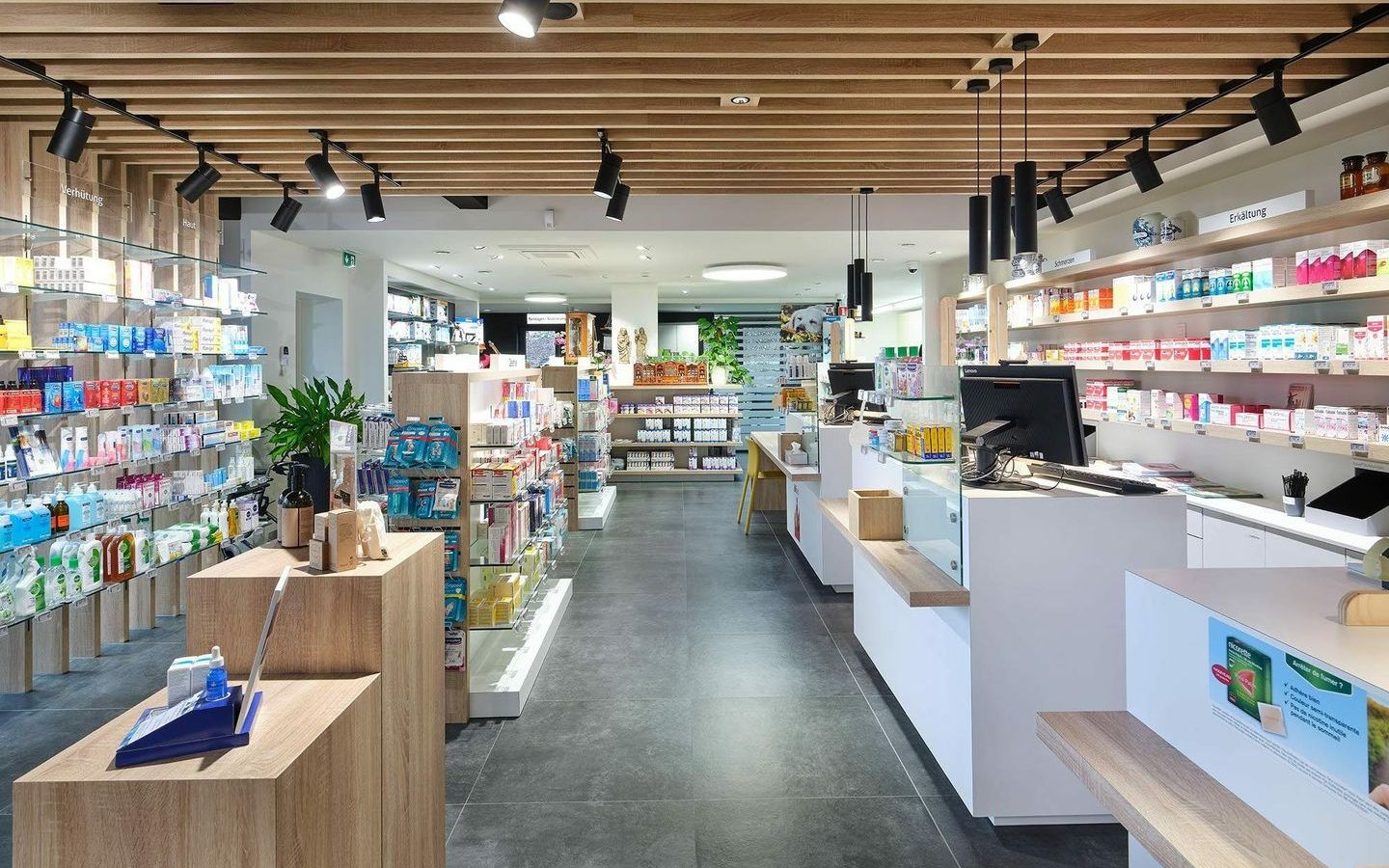
You may have felt it for some time. Something is not quite working in your pharmacy. Queues build up at certain times of the day. Your key products go unnoticed. The back office is overcrowded and difficult to organise. And every morning, you make do because “it still works”.
But working and working well are not the same thing. For your team, your patients or the long-term future of your pharmacy.
This checklist highlights eight concrete signs. It is not a full audit or a remote assessment. Rather, it is a simple tool to help you take a step back, look at your space and identify the signs that deserve your attention. For each point, we share what we see in practice, in Belgian pharmacies of all sizes.
Ready to look at your pharmacy with fresh eyes?
1. Your space is limited or poorly used
This is the most common observation. The issue is not always a lack of space, but often how that space is distributed. An oversized back office, a cramped patient area or square metres lost in circulation zones.
Ask yourself these questions: can your patients move around freely? Does your back office take up more space than your advice and sales area?
Duger Pharmacy is a good example. With a total area of just 50 m², it is one of the smallest pharmacies we have fitted out. Every decision was considered down to the millimetre: three counters integrated into a compact front office, a fully functional 15 m² back office and smooth circulation despite the limited floor space. Proof that a small, well-designed space can transform everyday life.
At Van Haeverbeeck Pharmacy, we redesigned the layout to enlarge the patient area while retaining a comfortable, well-organised back office. Discover the Van Haeverbeeck Pharmacy project →
The sign: if you feel that you are short of space while your back office is twice as large as necessary, the problem is not the floor area. It is how that area is distributed.
Image Gallery


2. Your key products lack visibility
Your patients walk past entire product ranges without noticing them. Your most strategic products are positioned too high, poorly lit or lost in confusing signage. As a result, the average basket remains limited to prescription items, and your team spends its time directing patients towards products they should have been able to find themselves.
Of course, merchandising begins before the products are placed on the shelves. Above all, your offering must match the needs and expectations of your patients. Which ranges deserve to be developed? Which should be given greater prominence? How should they be organised to make choosing easier?
A product’s visibility depends on more than its position. It is also influenced by contrast, lighting, background, eye level and the clarity of the different zones.
A relevant offering that is well positioned and clearly presented adds value to every category. Patients can find an answer to their needs more easily, while the pharmacy makes its offering clearer and strengthens its commercial potential.
At Lincent Pharmacy, the curve created by the shape of the space itself naturally draws attention to seasonal products and key ranges. The furniture does more than provide storage. It directs the eye to where it matters.
At Henry Pharmacy, the wooden slatted partition has become a genuine signature feature. It allows natural light to enter while showcasing the pharmacy and its products. The lighting and materials work together to enhance the offering.
The sign: if your patients regularly ask where to find products that are already on display, the space is not yet guiding their eye effectively.
Image Gallery


3. Queues are long or disorganised
Observe the queue during peak hours. Does it run in a straight line from the entrance to the counter? Does it sometimes stretch outside? Patients waiting for a preparation mingle with those looking for quick advice. The atmosphere becomes tense. So does your team. If patients wait without looking at the products or taking advantage of what the space has to offer, your space is probably no longer fulfilling its role.
Two things are lost in the process. Privacy, because everyone can hear the conversation at the counter. And discovery, because no one browses the self-service area.
A good layout does not eliminate waiting. It organises it. A clear route, with separate areas for the counter, quick advice and waiting, allows everyone to understand where they need to go. This is also where a well-designed commercial strategy comes into its own: impulse displays, seasonal products or promotions placed in the waiting area turn unavoidable waiting time into a useful moment.
At Servais Pharmacy in Mont-Saint-Pont, circulation was redesigned around four zones - Nature, Beauty, Babies & Young People, and Health - with counters equipped with screens and impulse displays positioned in the centre of the space. Patients move through the different zones instead of waiting in a single queue.
At Saint-Pierre Pharmacy from Morialmé, we designed a guided route that leads patients through the different zones, from the advice counter to the consultation room. They discover the offering as they move around instead of standing still in one place.
The sign: if your patients form a compact queue between the counters and no one browses the self-service area, your flow needs to be reconsidered.
Image Gallery


4. A lack of privacy limits conversations
How often does a patient hesitate to ask a question because three people are waiting just behind them? Privacy is not a luxury. It is a prerequisite for pharmaceutical advice to fully serve its purpose.
At Shyns Pharmacy, we integrated a dedicated private consultation area with sliding doors. It provides comfort and discretion while fitting naturally into the patient journey. No hidden corridor or separate room tucked away from the rest of the pharmacy: a fluid space that respects the need for privacy.
Creating this space is the first step. Embedding it in the team’s habits is a second, equally important one. A private consultation area only gains value when it is naturally offered to the patient at the right time, as an obvious part of their journey.
A private consultation area was also integrated into the initial design of d’Aiseau Pharmacy and Tilman Pharmacy.
The sign: if your patients lower their voices at the counter or save their questions for later, your layout is not providing them with the privacy they need.
Image Gallery


5. Your back office lacks ergonomics
The patient area is often discussed. The back office rarely is. Yet this is where your team spends a large part of its day. Poorly organised stock, constant trips back and forth, a poorly integrated robot or a cluttered laboratory: every source of friction has an impact on service in the front office. A dark, disorganised and uninviting space also affects the team’s morale, day after day.
At Tilman Pharmacy, the pharmacy owner chose an advanced level of automation. We integrated this solution into the layout and saw the working comfort it provides every day: less handling and more time available for advice.
We are often asked about the value of a robot. It occupies a significant amount of space and represents a substantial investment. However, when it is suited to the volume of activity, the stock and the available space, its benefits are real. The decisive factor remains its sizing. If it is too small to handle your stock, it takes up valuable space without delivering the expected results. When correctly sized, even in a small pharmacy, it streamlines dispensing, frees up time for the team and genuinely improves everyday working conditions.
At Pharmastrée Pharmacy, the technical functions — stock, office, laboratory and robot — were placed in the oldest part of the building, freeing up the bright, glazed extension for welcoming patients. This balanced distribution between the front and back office has made the team’s daily work considerably smoother.
The back office does not necessarily have to remain invisible. Certain areas, such as the preparation area or the pharmacy owner’s office, can be integrated into the patient journey, either subtly or more deliberately.
At Shyns Pharmacy, the preparation area opens onto the pharmacy through semi-transparent, green-tinted glass. The activity can be glimpsed without ever being fully exposed.
At Lohisse Pharmacy, the pharmacy owner’s office is partially visible, with a large racing car poster revealing his passion for the sport. This visibility is beneficial on both sides of the counter. For the team, being able to keep an eye on the pharmacy from the back office is reassuring. For patients, a glimpse behind the scenes humanises the pharmacist’s profession and brings people closer together.
The sign: if your team makes dozens of trips between the stockroom and the counter every day, or if your storage is overflowing and restocking requires more effort than serving patients, your back office needs attention.
Image Gallery


6. Your two entrances make it difficult to manage patient flows
This is a less common configuration, but when it does occur, it can quickly become a burden on the organisation. Two entrances mean two patient flows to manage simultaneously, blind spots to monitor and a route that is more difficult to structure.
The solution rarely involves closing one of the entrances. It lies in a layout that brings both flows together into one coherent route, with clear signage and strategically positioned counters.
At Cortebeek Pharmacy in Edegem, the challenge was precisely to organise a 150 m² space with two entrances. The layout brought both flows together into one coherent route and created more high-traffic areas, notably through a clearly identifiable OTC zone beneath a backlit ceiling.
The sign: if patients enter through one door without immediately seeing the counter, or if your team loses time monitoring two entrances, the layout can turn this constraint into an advantage.
Image Gallery


7. Your visual identity is not reflected in the space
Your logo is displayed in the window. You know which colour and atmosphere you want people to experience when they walk through the door, and you know the DNA of your pharmacy. But the space itself does not yet tell that story. The colours, materials and overall atmosphere could just as easily belong to the pharmacy next door.
A pharmacy has a personality. It reflects the pharmacy owner’s vision, the team’s values and the patients you welcome.
Pharmastrée Pharmacy illustrates this approach well. The pharmacy owner did not want a purely commercial style. She dreamed of a warm, feminine and natural place dedicated to well-being. Every element, from the materials to the shapes, was selected to embody that vision. The result is a pharmacy that patients recognise and feel at home in.
Labuissière Pharmacy, meanwhile, has a bright, airy and contemporary atmosphere, in keeping with the overall healthcare project led by the pharmacist and her husband, who is a dentist.
The sign: if a patient entering your pharmacy could just as easily think they were in the pharmacy next door, your identity is not yet being expressed through the space.
Image Gallery


8. Digital tools are absent or poorly integrated
Screens, interactive kiosks, click and collect, dispensing robots: digital tools do not replace human relationships. When properly integrated, they strengthen them. When poorly integrated, they create clutter.
At Servais Pharmacy in Mont-Saint-Pont, digital technology was considered from the earliest stages of the layout design: interactive screens displaying targeted information, kiosks for connected devices and in-pharmacy click and collect. These uses directly influence how the space is organised, which is why we integrate them from the outset.
At Saint-Pierre Pharmacy, a dispensing robot and digital screens complement the layout to streamline the team’s daily work, without ever taking precedence over a warm, personal welcome.
The sign: if your digital tools look as though they have simply been placed in the space as a foreign element, or if you are reluctant to integrate them for fear of changing the character of your pharmacy, they have not been considered as part of the layout.
Image Gallery


How many signs did you identify?
This checklist is not intended to create a sense of urgency. Some of these points can wait. Others are probably part of your daily experience, even if you have never put them into words.
What matters is recognising that every source of friction within the space has a chain reaction: on your team’s comfort, your patients’ experience and your turnover per square metre.
Let’s create value together
At PLUO, we support pharmacists throughout Belgium, from the initial reflection through to installation, whatever the size of the pharmacy.
A redesigned space means a team that regains peace of mind, patients who feel genuinely welcome and a pharmacy designed for performance and long-term sustainability.
Do you recognise your pharmacy in several of these points? Let’s talk about it. We always begin by listening, understanding your reality and helping you gain a clearer view of what can be changed.
Feel free to contact our teams!